Designing with Emotion: How Colour Shapes the Way We Experience Space
An exploration of colour psychology in interior design, and how tone, contrast, and material influence mood and spatial experience.
In interior design, colour is one of the most immediate and subconscious ways a space communicates with its user as it sets the emotional tone of a space. It can quieten a room, energise it, ground it, or heighten its presence. The same spatial layout, when approached through different colour strategies, can evoke entirely different responses.
When making design decisions, colour is not selected in isolation. It is developed through conversation and understanding how a client wants to feel within a space and then translating that into calibrated tonal decisions.
Working with Tonal Behaviour
Colour does not behave uniformly. Its emotional impact shifts significantly depending on its tone, saturation, and context within a palette.
A single colour can move across emotional spectrums. Light, desaturated tones tend to feel open, calm, and recessive.
Mid-tones introduce clarity and liveliness whereas deep, saturated shades create intimacy, drama, and visual weight.
In practice, this allows a base colour to be adapted across a project, shifting in tone and saturation to support different moods without losing overall coherence.
Perception and Spatial Experience
Beyond mood, colour also influences how a space is perceived.
Lighter tones tend to recede, allowing surfaces to feel further apart and spaces to appear more open. Darker shades bring surfaces visually closer, creating a sense of enclosure and intimacy.
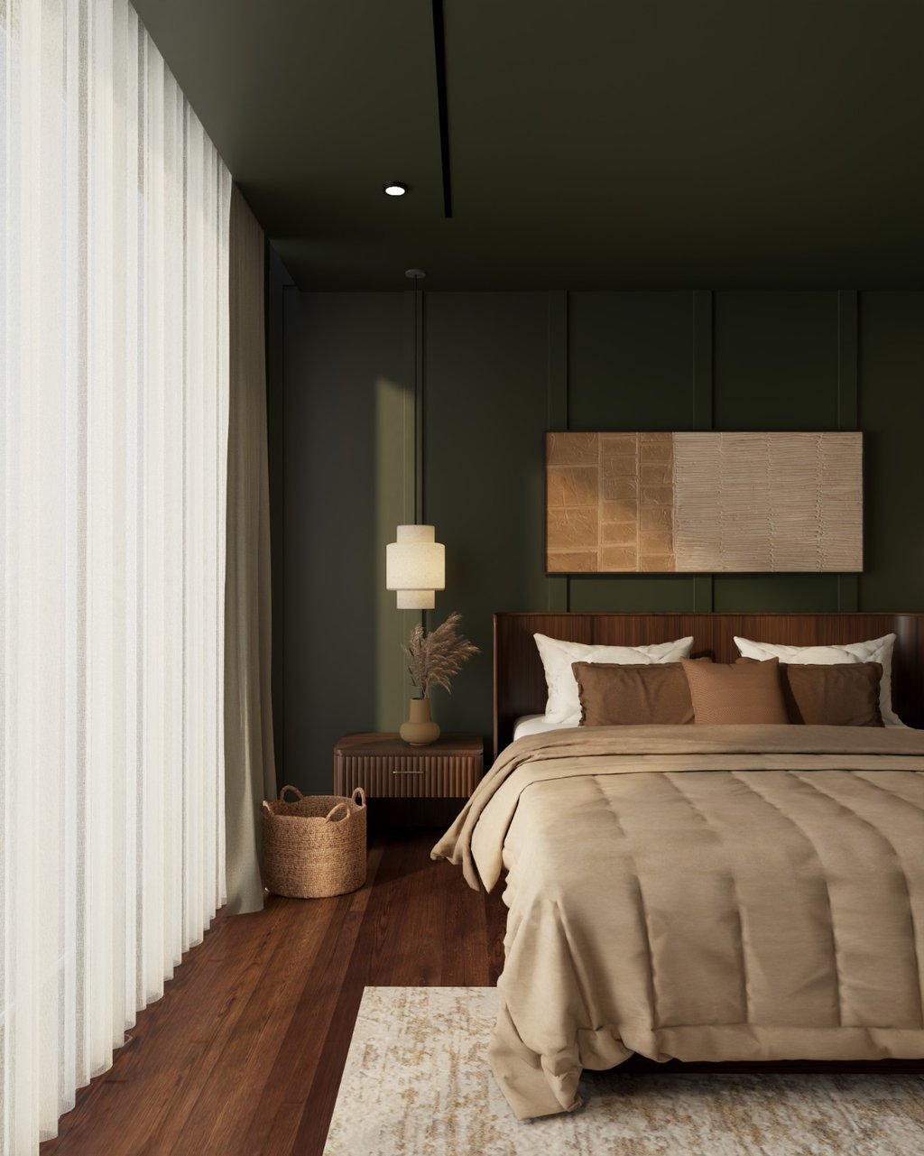
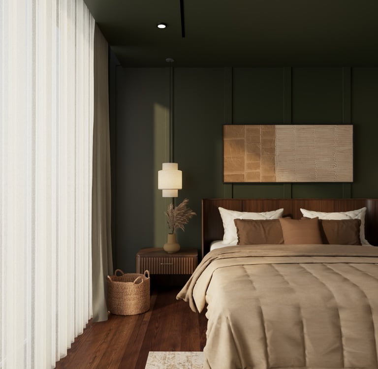
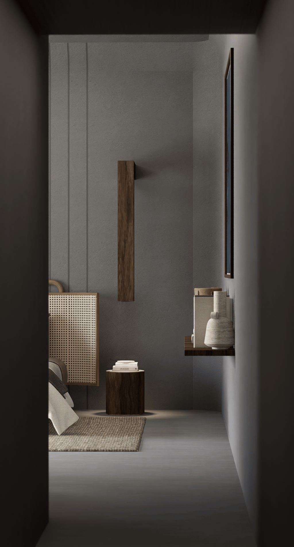
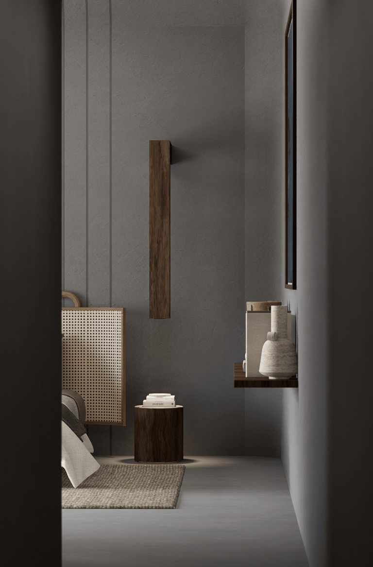
A common challenge in residential spaces is a compact bedroom with limited natural light. In practice, the approach is to work with a continuous, warm neutral palette carried across walls, upholstery, and drapery. By reducing contrast and allowing surfaces to blend into one another, the edges of the room soften, and the space begins to feel more expansive without relying on brightness alone.
These decisions are rarely about making a room simply look bigger or feel smaller. They direct how the eye moves, where it pauses, where it travels, and how the space is ultimately read.
Colour, in this sense, becomes a way of editing perception.
Not all spaces feel the same. Some environments are meant to energise and engage, while others are designed to quieten and restore. Colour plays a key role in regulating this.
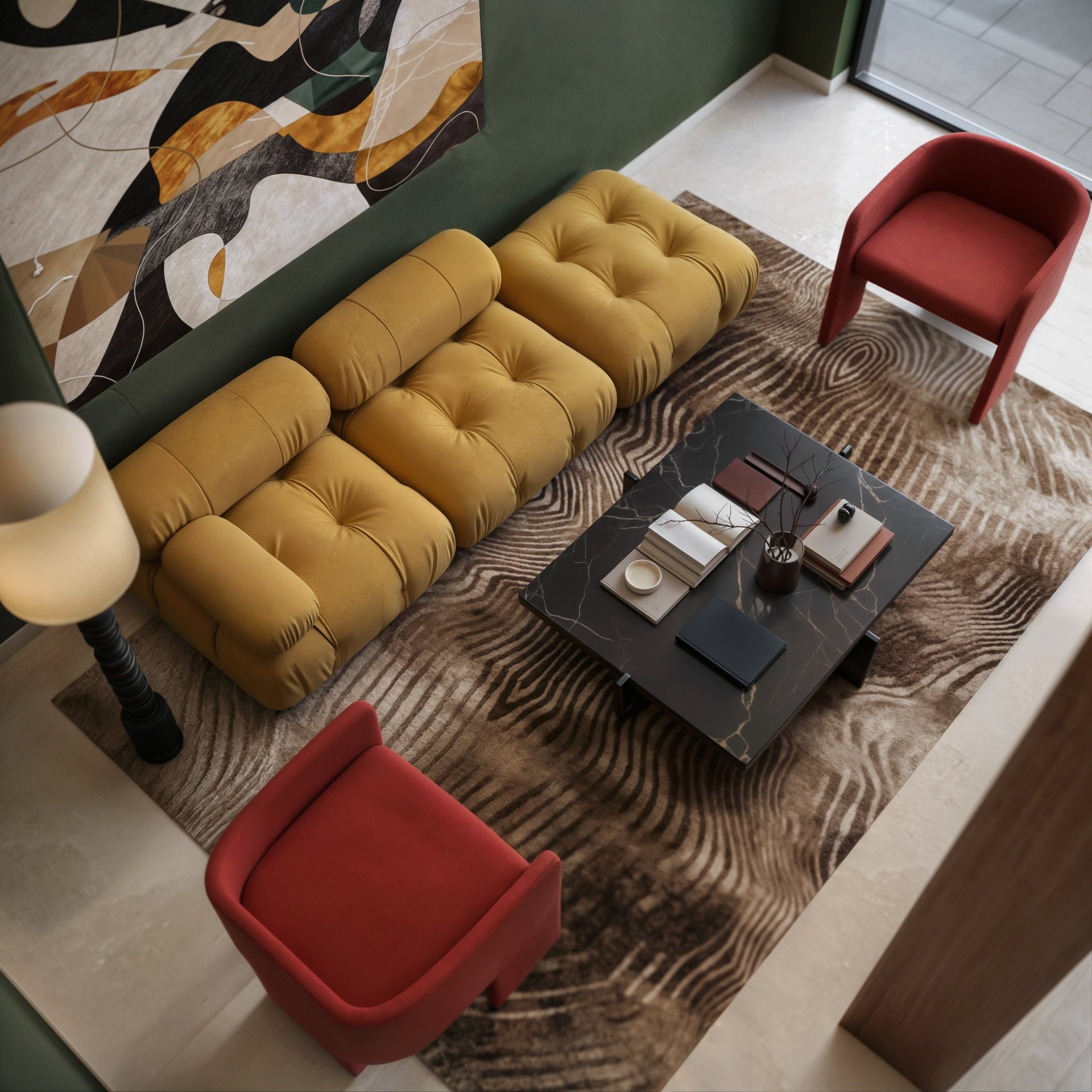
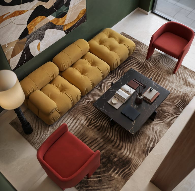
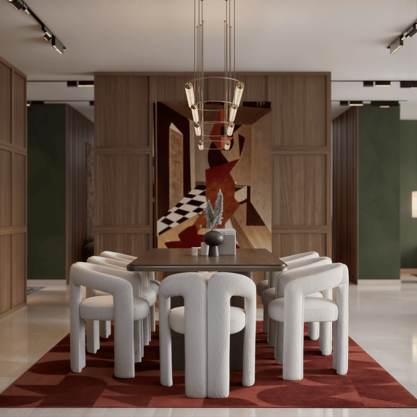
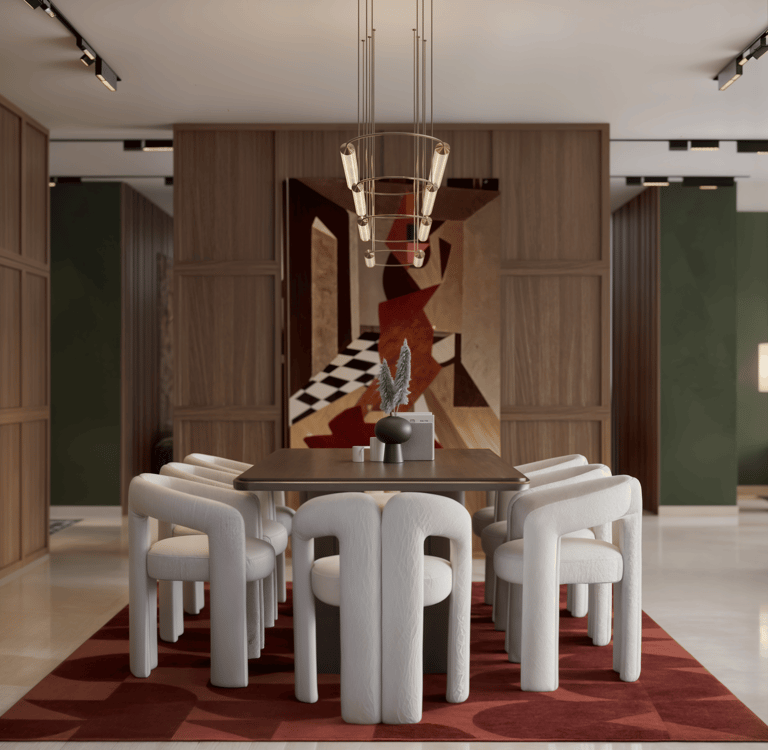
Higher contrast palettes, sharper tonal shifts, and saturated hues tend to create a more active, stimulating environment. When used intentionally, this can support social interaction and movement.
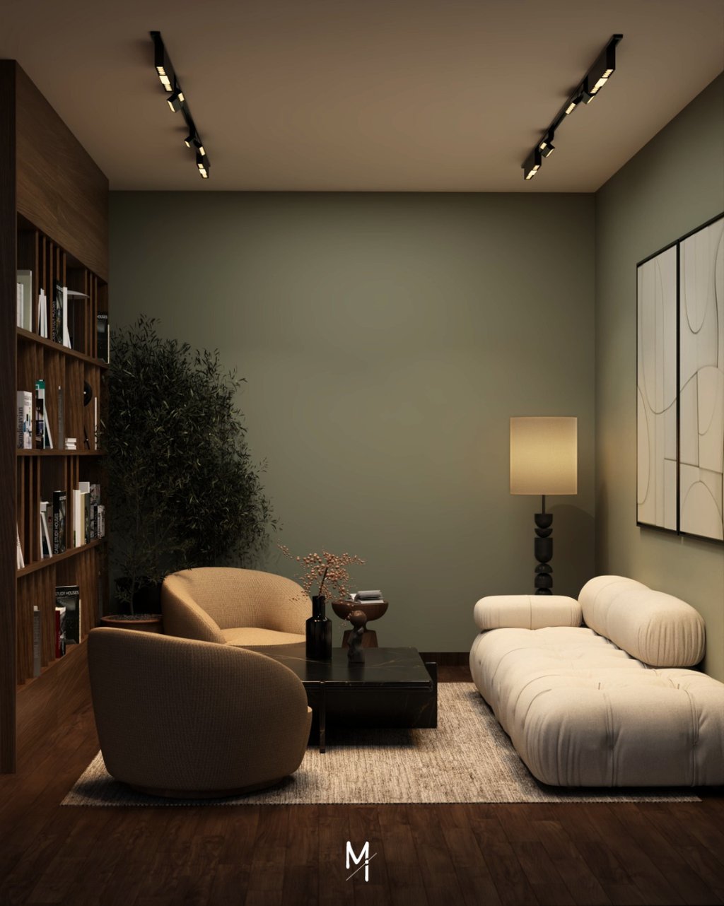
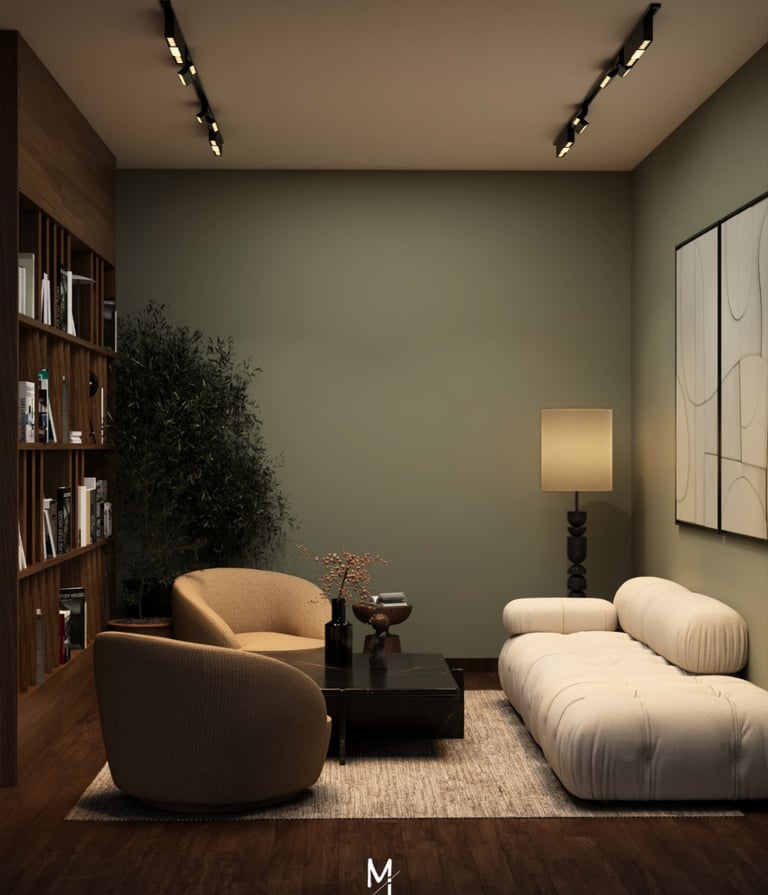
Conversely, spaces designed with tonal continuity, softer contrasts, and muted palettes allow the eye to move more gently. This reduces visual strain and creates a sense of ease often experienced as calm, even if not consciously recognised.
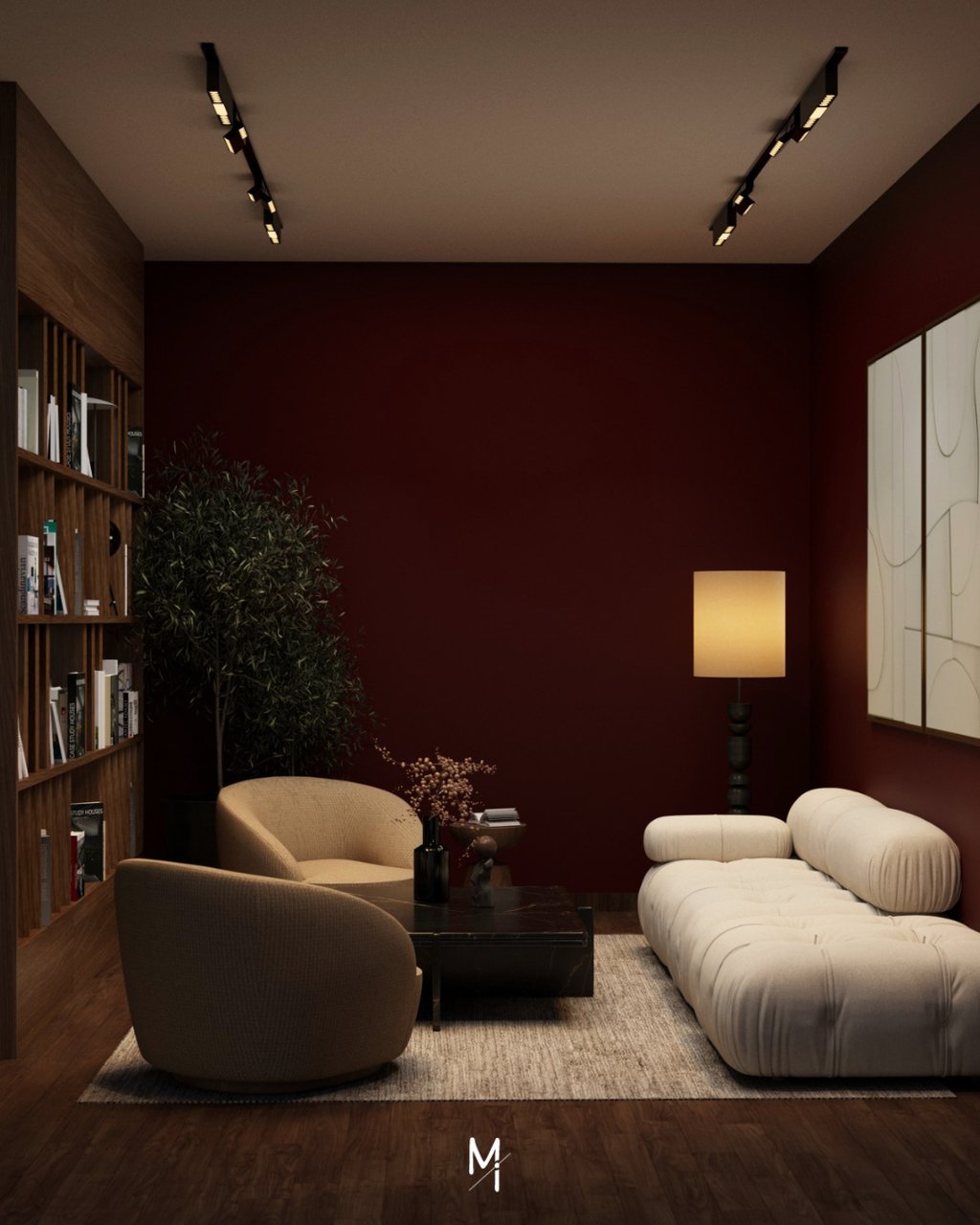
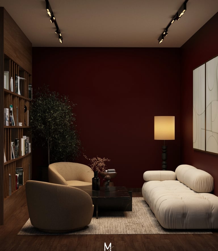
In living spaces, visual overwhelm is usually elements competing for attention at the same level. When furniture, finishes, and surfaces all carry similar visual weight, the eye keeps moving without finding a clear point to settle. This creates a subtle sense of restlessness.
A more considered approach is to create tonal hierarchy.
Instead of spreading contrast evenly across the room, it is used with intention. The space sits within a calm, controlled range, while stronger contrast is introduced in specific moments such as a focal piece, a transition point, or a key surface. This gives the eye a place to land, making the space feel composed rather than busy.
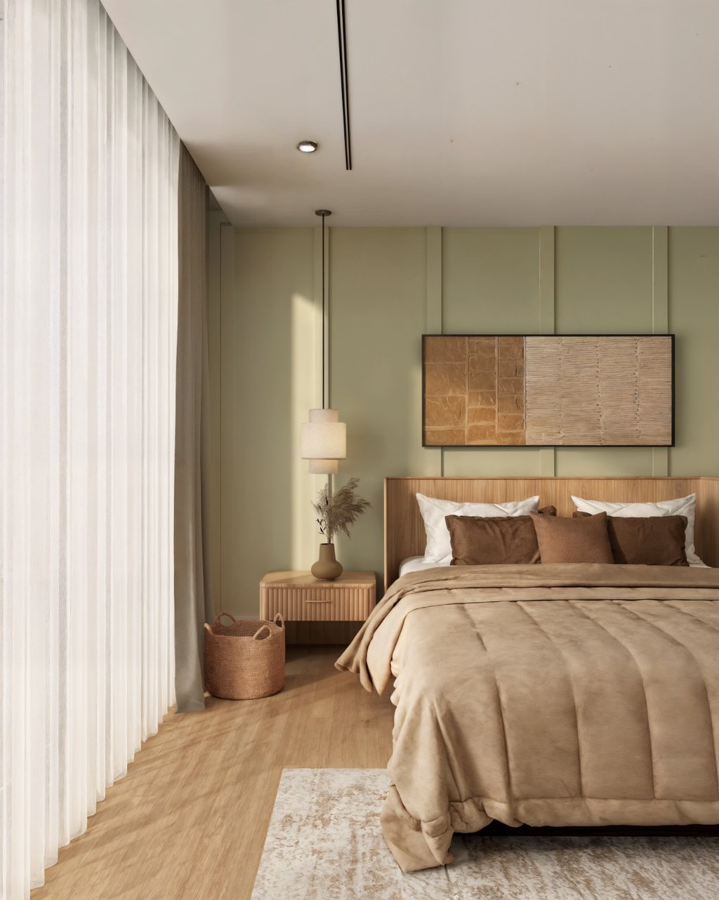
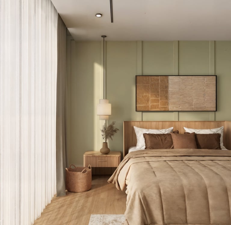
In bedrooms, on the other hand, the challenge is different. Here, palettes are often kept neutral, but when everything is too similar, the space can feel flat. The solution is not to add more colour, but to create gentle variation within the same tone through undertones, textures, and finishes. This adds depth without disrupting the overall calm.
Managing Sensory Load
Translating Emotion into Design Decisions
Colour psychology is meaningful as it helps translate how you want to live within a space.
If you’re envisioning a living room that feels quiet, low-stimulus, and easy to unwind in at the end of the day, choosing a “calming colour” in isolation will rarely make that true. Instead, the palette is softened through desaturated tones, reduced contrast, and materials that absorb rather than reflect visual noise. The result is not just a calm-looking room, but one that feels inherently slower and more settled.
On the other hand, if the intention is to create a space that feels warm, social, and gently energised such as a family lounge or dining area, the palette may shift subtly. Warmer undertones are introduced, contrasts are slightly heightened, and colour is layered in a way that encourages interaction without becoming overwhelming.
For more private spaces like bedrooms, the approach becomes more controlled.
Rather than introducing contrast or variation, the palette is kept within a tighter tonal range, allowing the space to feel continuous and uninterrupted.
Depth is introduced more subtly through shifts in material, finish, and undertone rather than obvious colour contrast. This creates a sense of quiet that feels composed rather than minimal, where the space holds attention without demanding it.
Colour in a space is always seen through something. It doesn’t exist only on walls. It lives across surfaces and objects.
In practice, a palette is distributed:
Through larger surfaces like walls and flooring, which establish the base mood
Through furniture, which introduces weight and anchoring
Through textiles such as cushions, rugs, and drapery, which soften and layer
Through artwork and objects, which add contrast, accent, or disruption
This layering allows a space to feel cohesive without feeling flat. Even within a restrained palette, variation in material creates subtle shifts by how light is absorbed, reflected, or diffused, adding depth without introducing visual noise.
It also allows flexibility. A space does not need to rely on permanent elements alone to carry its identity. Colour can be adjusted, intensified, or softened through interchangeable layers making the environment feel responsive rather than fixed.
Ultimately, how colour is applied is just as critical as which colour is chosen.
When Colour Meets Materiality
Colour is often approached as a final selection, a decision made at the end of a process.
In reality, it operates much earlier. It informs how a space is perceived, how it is experienced, and how it is remembered. When calibrated carefully, it creates a sense of ease where nothing feels excessive, and nothing feels unresolved. This is why colour moves beyond decoration.
The outcome is not a palette, but an environment that feels considered, coherent, and inherently aligned with how it is meant to be lived in.
Beyond Colour as a Choice
-----------------------------------
At Moori our commitment is to deliver designs that meet and exceed your expectations.
Curious to learn more? We encourage you to engage with our expert designers through a complimentary consultation at moori.ae/complimentary-consultation.
Let's begin the journey of transforming your space into a masterpiece.
Address:
Office No: 304 , Building A1
Emirates Sports Hotel Apartments
Opposite Fit Republik, Sports City
Dubai, United Arab Emirates
Let's create an array of immersive experiences together!